You are here
JobViz
JobViz
Understanding how college preparation relates to employment prospects is crucial in positioning a student for successful post-college employment. Yet few tools for job seeking or job market assessment utilize visualizations. Visualizing job postings and helping students gain a better sense of the job market require both the representation of hundreds of majors and thousands of jobs and the display of the intangible relationships between them. To address these challenges, we developed JobViz, an interactive visualization system for university job postings. Combining the intuitiveness of node-link diagrams and the scalability of aggregation-based techniques, JobViz presents a visual overview of the relationships between majors and jobs. The proposed visualization features the simplicity and familiarity of a circular layout, hierarchical edge bundles, and tag clouds and provides both an overview of the database and the capacity for interactive queries to retrieve contextualized details. With this layout, we also tried to remove any inherent bias in the data to enable students to look at and understand all of the data.
The job posting data we used in this project is from Rutgers University Career Services (http://careers.rutgers.edu/) portal. Companies fill out a questionnaire before posting a new job and this information includes: Employer, Job Title, Position Type, Date, Majors, Class Level, City, State, Category, Job Description, and which major they think is most applicable to the job posting. The database contains anywhere from 5000 to 10,000 jobs at any one time.
For information about using or licensing JobViz please refer to the Rutgers Copyright Software Licensing Site.
Publication:
1. Liu, Li, Deborah Silver, and Karen Bemis. "JobViz: Interactive Visualization of Majors & Jobs." IEEE VIS. 2016.
2. Liu, Li, Deborah Silver, and Karen Bemis. "Application-Driven Design: Help Students Understand Employment and See the “Big Picture”." IEEE computer graphics and applications 38.3 (2018): 90-105.
User Interface
JobViz is a web-based application implemented using D3.js (https://d3js.org/), a JavaScript library for data visualization. The user interface (as shown in Figure 1) consists of four components, including a control panel and an inset of statistical view on the left module, a central module for data visualization display, and a right module for listing and filtering job postings.
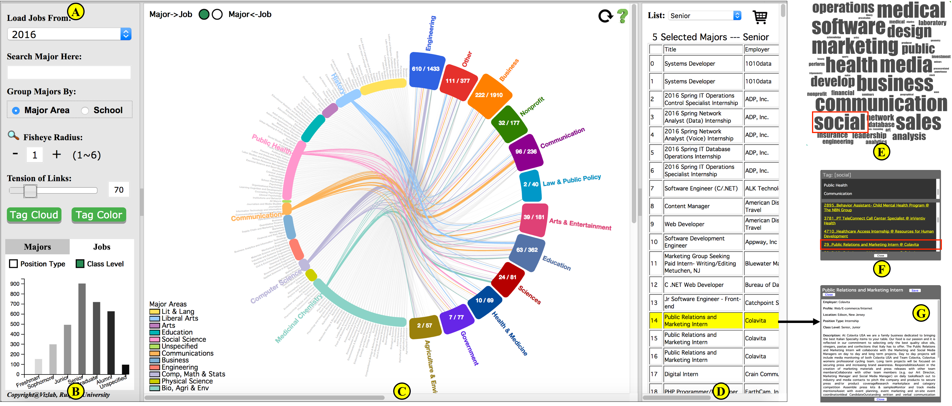
Fig. 1. The user interface contains three modules. The left module has (a) a control panel, and (b) an inset of a statistical view. The center module (c) visualizes the job posting database as a circular layout. Majors are on the left side, and career sectors are on the right. A user can select majors or career sectors to see their relationships in a Relation View. Here a Relation View visualizes the links between five selected majors and career fields containing job postings requesting at least one of these majors. (d) The right module lists job postings. In the Tag Cloud View (e), the keywords of job postings that are listed in (d) are displayed as tag cloud. Each term in the tag cloud is clickable and is linked to a list of job postings as in (f). A particular job posting can be identified from (d) or (f).
System Overview
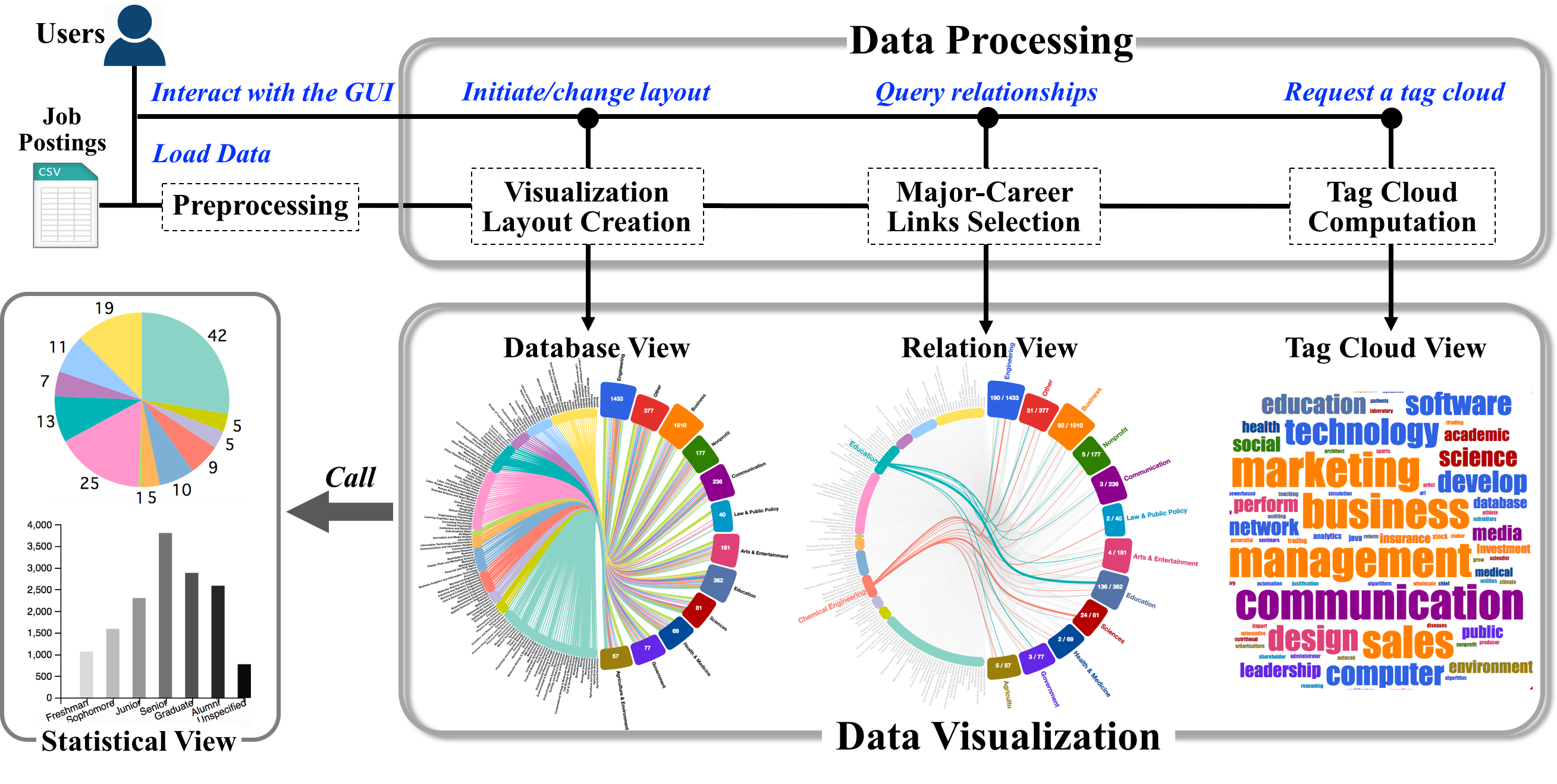
Fig. 2. A system overview of JobViz. The system has a data processing part and a visualization part with three coordinated views: Database View, Relation View, and Tag Cloud View. Additional statistics of majors and jobs can be found in a Statistical View.
Use Cases
1. Getting an Overview

Fig. 3. An overview of the job posting data posted in 2016. The initial Database View in (a) illustrates the distribution of jobs and majorcareer links. The Database View in (b) uses density and thickness of links to show the popularity of majors in the job market. The Tag Cloud Views in (c) and (d) summarize keywords of internships and full-time experienced jobs respectively.
2. Query by College Majors

Fig. 4. Two different Relation Views showing links from the chosen majors to related career sectors. Left: the major group "Social Science Majors" is chosen. Right: the major "Economics" is chosen. The accompanying Statistic Views display the histograms of jobs as bar charts.
3. Query by Career Sectors

Fig. 5. Three different Relation Views showing links from the chosen career sectors to majors listed in those job postings. The “Communication” sector in the left and the “Arts & Entertainment” sector in the center mainly focus on majors of arts, liberal arts, and social science, while the “Science” sector in the right mostly recruits from STEM majors. The accompanying Statistic Views display the distributions of connected majors as pie charts.
Techniques
The techniques used in the visulization project is mainly by Python
Related Publications
1. Park, Chanhee, et al. "GitViz: An Interactive Visualization System for Analyzing Development Trends in the Open-Source Software Community." 2019 IEEE Pacific Visualization Symposium (PacificVis). IEEE, 2019.
2. Li, Mingran, et al. "CareerVis: Hierarchical Visualization of Career Pathway Data." IEEE computer graphics and applications 38.6 (2018): 96-105.
3. Chen, Yingjie, et al. "Career Path-Understand the Relation of Majors to Occupations Through Interactive Visualization." (2016).